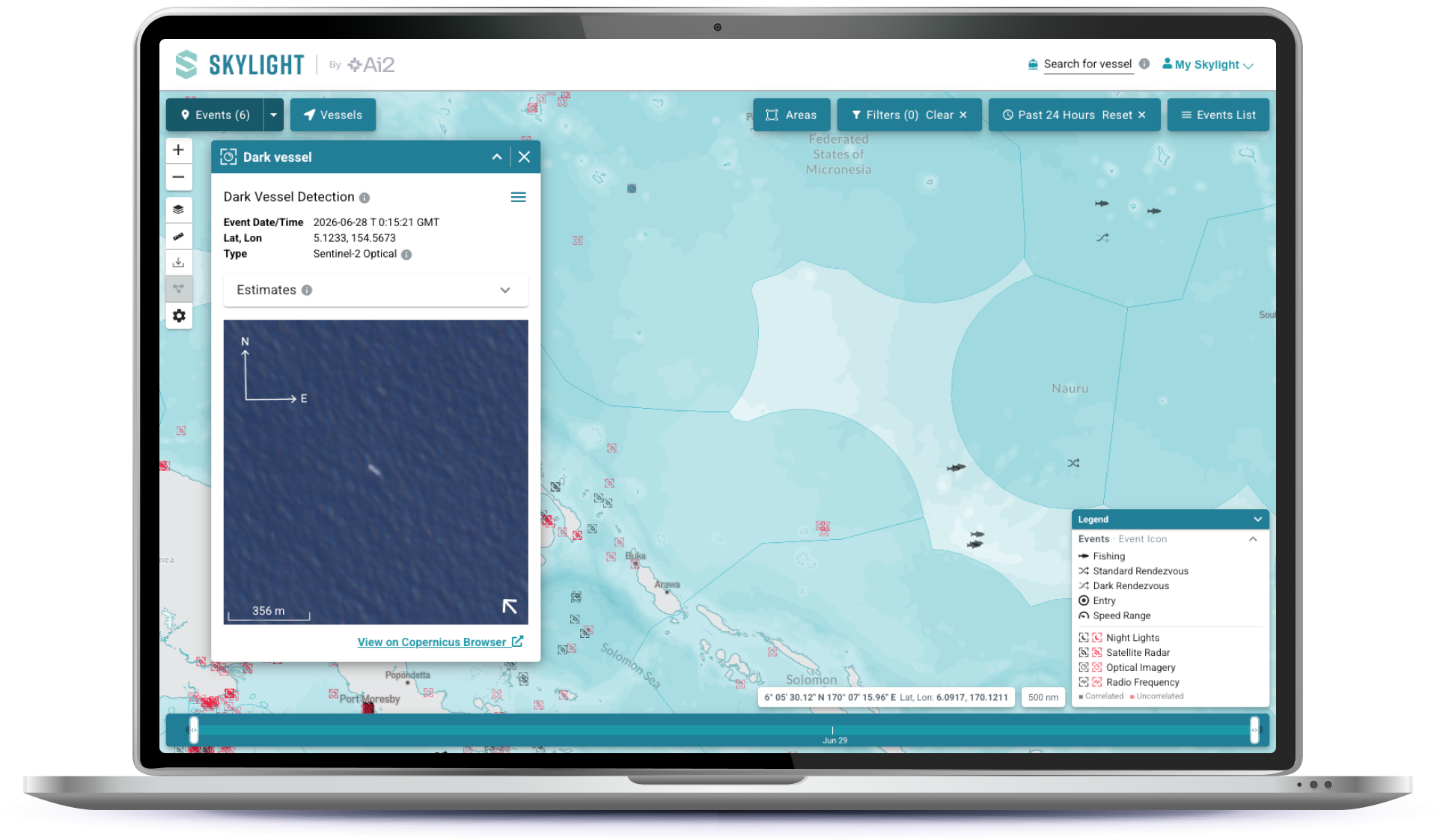
Ai2 / Skylight

An illustrative sketch of a flower

Skylight

Eight years designing a complex platform to feel simple – and the institutional knowledge to know when it's time for a reset

Overview

Skylight is AI2's platform for tracking and analyzing events using satellite imagery. I've been part of the design team since its earliest days – around 2017, when it was still being built at Vulcan. Over eight years, the product has gone through multiple leaders, multiple pivots, and multiple identities. I've been there for all of it: the original analyst-focused UI, the dramatic visual overhaul, the conservation pivot, the branding experiments, and finally, the public launch. The 2025 UI refresh wasn't just a redesign – it was a chance to thoughtfully untangle debt we’d accumulated over time.

My role

One of two UX designers who partnered with the Skylight team from the beginning, with involvement that expanded and contracted over the years depending on team focus and my availability. In 2025, I led the design effort for the public launch refresh. Collaborators have included engineers, product leads, program managers, and a rotating cast of stakeholders across multiple leadership regimes.

The challenge

Original UI: designing for one userIn the early days, Skylight was built with detailed input a specific in-house analyst. We designed around the tools he already knew, and the interface reflected his mental model more than a general user's. It worked for its context, but we ended up with a product designed for one, not for many.

A new leader, a new direction: the ops room eraWhen new leadership came in, they wanted to take the product in a completely different direction. We essentially started from scratch. The brief was vivid: think ops room – dark, moody, real-time. The design principles were "real time" and "simple." We wanted to alert people to activity, not overwhelm them with it. It was an exciting design challenge, and the result was visually striking.

The conservation pivot and growing functionalityAs Skylight began onboarding users in the conservation space, the needs shifted again. More functionality, more complex workflows, more diverse users who weren't analysts by training. We built quickly to keep up. At one point, we explored allowing different organizations to skin the platform in their own branding – an ambitious idea that ultimately got shelved as complexity and focus pulled us elsewhere.

How debt accumulatesNone of these decisions were wrong in isolation. Each made sense for where the product was at the time. But the cumulative effect – multiple rebrands, fast feature builds, API-first prioritization, an original design rooted in one specific analyst's workflow – left the UI carrying a lot of weight by 2025. I knew exactly where the debt had come from because I'd been in the room for most of it. That institutional knowledge turned out to be an asset when it came time to fix things.
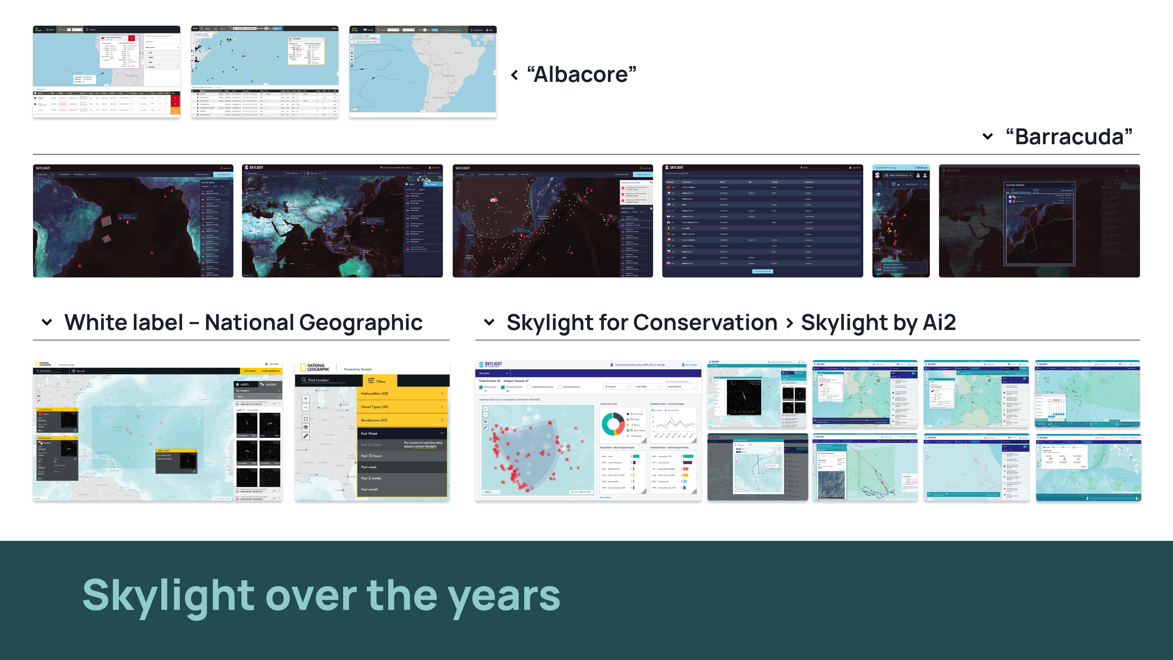
Skylight over the years

Skylight over the years

The refresh

By mid-2025, the decision to open Skylight to the public created a forcing function. The user base had grown, and users were telling us they preferred the interface over the API — which raised the stakes considerably. We had a lean team, competing priorities, and a rotating group of engineers, but the moment was right.

Audit and framingI started by mapping the debt across layout, components, navigation, and brand expression – understanding how it had accumulated, not just that it existed. That history informed which problems were structural and which were cosmetic, and helped me make better decisions about where to focus.

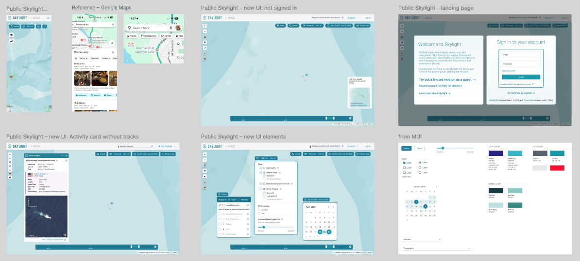
Mockups and iterative realization I developed a series of UI mockups to give the team something concrete to build from. Designs were realized in code by whoever was available, I'd capture a detailed feedback list, and we'd work through it in the next pass. Clear, well-documented handoffs were essential given the rotating developer situation.
An illustrative sketch of a flower

Much of our iterative work occurred outside of Figma – we used it to work out and capture key decisions, but it’s remarkable how sparse – and temporal the design page ended up being

What we tackled

  • Overall layout improvements
  • Areas, events, and filters menus – the highest-friction workflows
  • Mobile functionality, which had been lost and needed restoring
  • A refreshed logo with updated colors and a new "by Ai2" treatment
An illustrative sketch of a flower

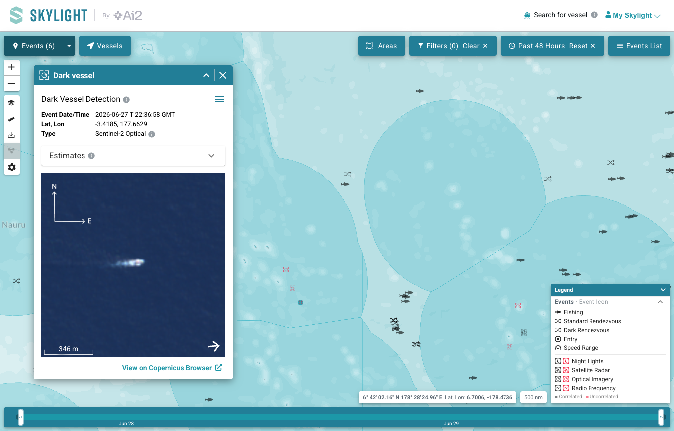
The Skylight UI today

Outcomes

The response at the internal reveal said it all. From the program manager via Slack...

“The 'ooos and aahhhhs' don't come through as clearly as I would have liked, but I can assure you in the room, it was high drama! They loved it.”

Skylight launched publicly with a significantly improved interface — better organized, visually refreshed, and functional on mobile again for the first time in years.

What’s next

The next design challenge is already in view: how do we surface more vessel information without adding clutter to an interface that's built around clarity? And Shippy, our latest Skylight feature, recently launched in early form – and the iterative loop is already spinning: design, ship, learn, refine.

Ai2 / Skylight

An illustrative sketch of a flower

Skylight

Eight years designing a complex platform to feel simple – and the institutional knowledge to know when it's time for a reset

Overview

Skylight is AI2's platform for tracking and analyzing events using satellite imagery. I've been part of the design team since its earliest days – around 2017, when it was still being built at Vulcan. Over eight years, the product has gone through multiple leaders, multiple pivots, and multiple identities. I've been there for all of it: the original analyst-focused UI, the dramatic visual overhaul, the conservation pivot, the branding experiments, and finally, the public launch. The 2025 UI refresh wasn't just a redesign – it was a chance to thoughtfully untangle debt we’d accumulated over time.

My role

One of two UX designers who partnered with the Skylight team from the beginning, with involvement that expanded and contracted over the years depending on team focus and my availability. In 2025, I led the design effort for the public launch refresh. Collaborators have included engineers, product leads, program managers, and a rotating cast of stakeholders across multiple leadership regimes.

The arc

Original UI: designing for one userIn the early days, Skylight was built with detailed input a specific in-house analyst. We designed around the tools he already knew, and the interface reflected his mental model more than a general user's. It worked for its context, but we ended up with a product designed for one, not for many.

A new leader, a new direction: the ops room eraWhen new leadership came in, they wanted to take the product in a completely different direction. We essentially started from scratch. The brief was vivid: think ops room – dark, moody, real-time. The design principles were "real time" and "simple." We wanted to alert people to activity, not overwhelm them with it. It was an exciting design challenge, and the result was visually striking.

The conservation pivot and growing functionalityAs Skylight began onboarding users in the conservation space, the needs shifted again. More functionality, more complex workflows, more diverse users who weren't analysts by training. We built quickly to keep up. At one point, we explored allowing different organizations to skin the platform in their own branding – an ambitious idea that ultimately got shelved as complexity and focus pulled us elsewhere.

How debt accumulatesNone of these decisions were wrong in isolation. Each made sense for where the product was at the time. But the cumulative effect – multiple rebrands, fast feature builds, API-first prioritization, an original design rooted in one specific analyst's workflow – left the UI carrying a lot of weight by 2025. I knew exactly where the debt had come from because I'd been in the room for most of it. That institutional knowledge turned out to be an asset when it came time to fix things.

Skylight over the years

Skylight over the years

The refresh

By mid-2025, the decision to open Skylight to the public created a forcing function. The user base had grown, and users were telling us they preferred the interface over the API — which raised the stakes considerably. We had a lean team, competing priorities, and a rotating group of engineers, but the moment was right.

Audit and framingI started by mapping the debt across layout, components, navigation, and brand expression – understanding how it had accumulated, not just that it existed. That history informed which problems were structural and which were cosmetic, and helped me make better decisions about where to focus.

Mockups and iterative realization I developed a series of UI mockups to give the team something concrete to build from. Designs were realized in code by whoever was available, I'd capture a detailed feedback list, and we'd work through it in the next pass. Clear, well-documented handoffs were essential given the rotating developer situation.

An illustrative sketch of a flower

Much of our iterative work occurred outside of Figma – we used it to work out and capture key decisions, but it’s remarkable how sparse – and temporal the design page ended up being

What we tackled

  • Overall layout improvements
  • Areas, events, and filters menus – the highest-friction workflows
  • Mobile functionality, which had been lost and needed restoring
  • A refreshed logo with updated colors and a new "by Ai2" treatment
An illustrative sketch of a flower

The Skylight UI today

Outcomes

The response at the internal reveal said it all. From the program manager via Slack...

“The 'ooos and aahhhhs' don't come through as clearly as I would have liked, but I can assure you in the room, it was high drama! They loved it.”

Skylight launched publicly with a significantly improved interface — better organized, visually refreshed, and functional on mobile again for the first time in years.

What’s next

The next design challenge is already in view: how do we surface more vessel information without adding clutter to an interface that's built around clarity? And Shippy, our latest Skylight feature, recently launched in early form – and the iterative loop is already spinning: design, ship, learn, refine.

Let’s work together

Ai2 / Skylight

An illustrative sketch of a flower

Skylight

Eight years designing a complex platform to feel simple – and the institutional knowledge to know when it's time for a reset

Overview

Skylight is AI2's platform for tracking and analyzing events using satellite imagery. I've been part of the design team since its earliest days – around 2017, when it was still being built at Vulcan. Over eight years, the product has gone through multiple leaders, multiple pivots, and multiple identities. I've been there for all of it: the original analyst-focused UI, the dramatic visual overhaul, the conservation pivot, the branding experiments, and finally, the public launch. The 2025 UI refresh wasn't just a redesign – it was a chance to thoughtfully untangle debt we’d accumulated over time.

My role

One of two UX designers who partnered with the Skylight team from the beginning, with involvement that expanded and contracted over the years depending on team focus and my availability. In 2025, I led the design effort for the public launch refresh. Collaborators have included engineers, product leads, program managers, and a rotating cast of stakeholders across multiple leadership regimes.

The arc

Original UI: designing for one userIn the early days, Skylight was built with detailed input a specific in-house analyst. We designed around the tools he already knew, and the interface reflected his mental model more than a general user's. It worked for its context, but we ended up with a product designed for one, not for many.

A new leader, a new direction: the ops room eraWhen new leadership came in, they wanted to take the product in a completely different direction. We essentially started from scratch. The brief was vivid: think ops room – dark, moody, real-time. The design principles were "real time" and "simple." We wanted to alert people to activity, not overwhelm them with it. It was an exciting design challenge, and the result was visually striking.

The conservation pivot and growing functionalityAs Skylight began onboarding users in the conservation space, the needs shifted again. More functionality, more complex workflows, more diverse users who weren't analysts by training. We built quickly to keep up. At one point, we explored allowing different organizations to skin the platform in their own branding – an ambitious idea that ultimately got shelved as complexity and focus pulled us elsewhere.

How debt accumulatesNone of these decisions were wrong in isolation. Each made sense for where the product was at the time. But the cumulative effect – multiple rebrands, fast feature builds, API-first prioritization, an original design rooted in one specific analyst's workflow – left the UI carrying a lot of weight by 2025. I knew exactly where the debt had come from because I'd been in the room for most of it. That institutional knowledge turned out to be an asset when it came time to fix things.

Skylight over the years

Skylight over the years

The refresh

By mid-2025, the decision to open Skylight to the public created a forcing function. The user base had grown, and users were telling us they preferred the interface over the API — which raised the stakes considerably. We had a lean team, competing priorities, and a rotating group of engineers, but the moment was right.

Audit and framingI started by mapping the debt across layout, components, navigation, and brand expression – understanding how it had accumulated, not just that it existed. That history informed which problems were structural and which were cosmetic, and helped me make better decisions about where to focus.

Mockups and iterative realization I developed a series of UI mockups to give the team something concrete to build from. Designs were realized in code by whoever was available, I'd capture a detailed feedback list, and we'd work through it in the next pass. Clear, well-documented handoffs were essential given the rotating developer situation.

An illustrative sketch of a flower

Much of our iterative work occurred outside of Figma – we used it to work out and capture key decisions, but it’s remarkable how sparse – and temporal the design page ended up being

What we tackled

  • Overall layout improvements
  • Areas, events, and filters menus – the highest-friction workflows
  • Mobile functionality, which had been lost and needed restoring
  • A refreshed logo with updated colors and a new "by Ai2" treatment
An illustrative sketch of a flower

The Skylight UI today

Outcomes

The response at the internal reveal said it all. From the program manager via Slack...

“The 'ooos and aahhhhs' don't come through as clearly as I would have liked, but I can assure you in the room, it was high drama! They loved it.”

Skylight launched publicly with a significantly improved interface — better organized, visually refreshed, and functional on mobile again for the first time in years.

What’s next

The next design challenge is already in view: how do we surface more vessel information without adding clutter to an interface that's built around clarity? And Shippy, our latest Skylight feature, recently launched in early form – and the iterative loop is already spinning: design, ship, learn, refine.