Starbucks

An illustrative sketch of a flower

Starbucks

In-house contract designer on a global site redesign – consumer experience at one of the world's most recognized brands

Overview

Starbucks.com is used by customers around the world, in a variety of languages. As a contract designer embedded in the Starbucks digital team, I was brought in to help design a global update to the site – starting with the homepage. The goal was a more modern design and a flexible system that could offer a rich, informative experience for customers. I worked with the internal project team, including a UX researcher, engineers, and multiple stakeholders – as well as outside vendors. My role covered visual design and collaboration on the new CMS, ensuring on-brand execution of the redesign across a growing digital footprint.

My role

Contract visual designer, in-house. Worked closely with colleagues on the Global Web Team to design appealing and intuitive interfaces – for desktop, tablet, and mobile devices – in order to help our customers easily and effectively engage with Starbucks.com.

The work

HomepageThe homepage was the starting point for the redesign – the foundation everything else would build from. We wanted something that felt modern and flexible, able to surface seasonal campaigns and evergreen content without feeling rigid. It needed to be responsive, and to display Starbucks Rewards stats to customers with various amounts of information that needed to be easily scannable – in multiple languages.
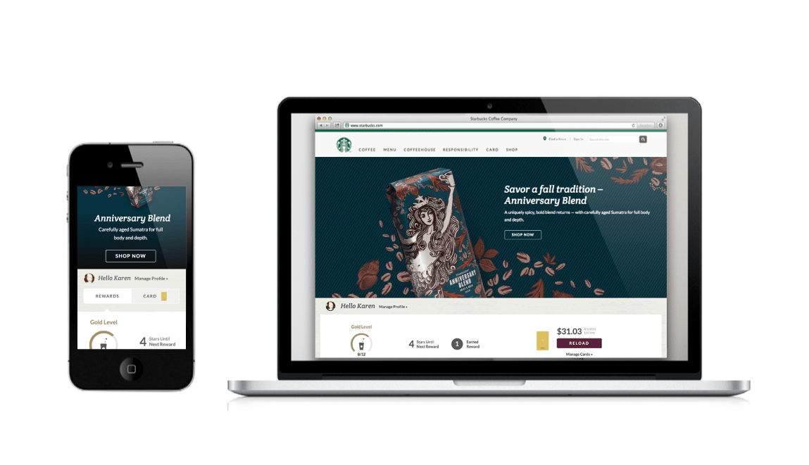
Starbucks homepage + rewards dashboard

Starbucks homepage + rewards dashboard

Starbucks.com/coffeeAfter launching the new homepage and global nav, we took on the coffee section – a set of rich, immersive pages designed to help customers easily and intuitively find their perfect coffee, learn how to brew, and shop for beans. The challenge was balancing depth of content with clarity of navigation, and making the experience feel as inviting as the product itself.
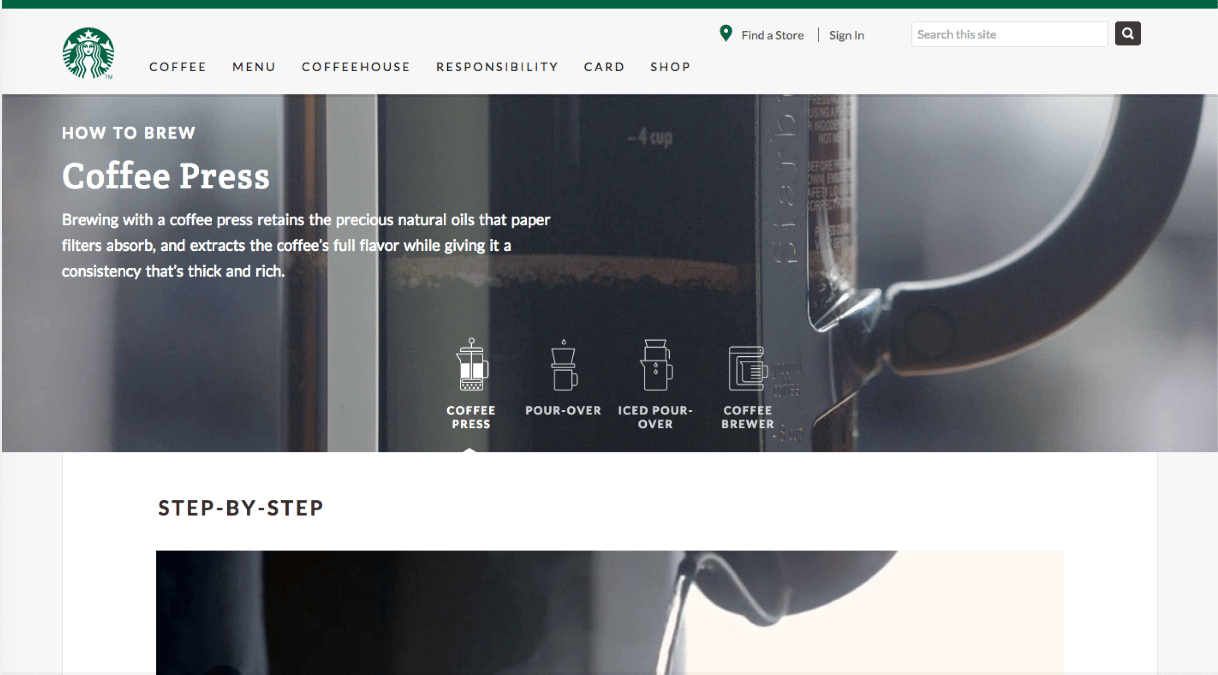
Starbucks coffee

/coffee

Store LocatorThe Store Locator is one of the most-used features on Starbucks.com and my first project as a contractor. Working with the Global Web Team, I worked up wireframes to create a clean, attractive, and intuitive interface – one that had to work equally well on desktop and mobile, for a customer who just wants to find the nearest store fast.
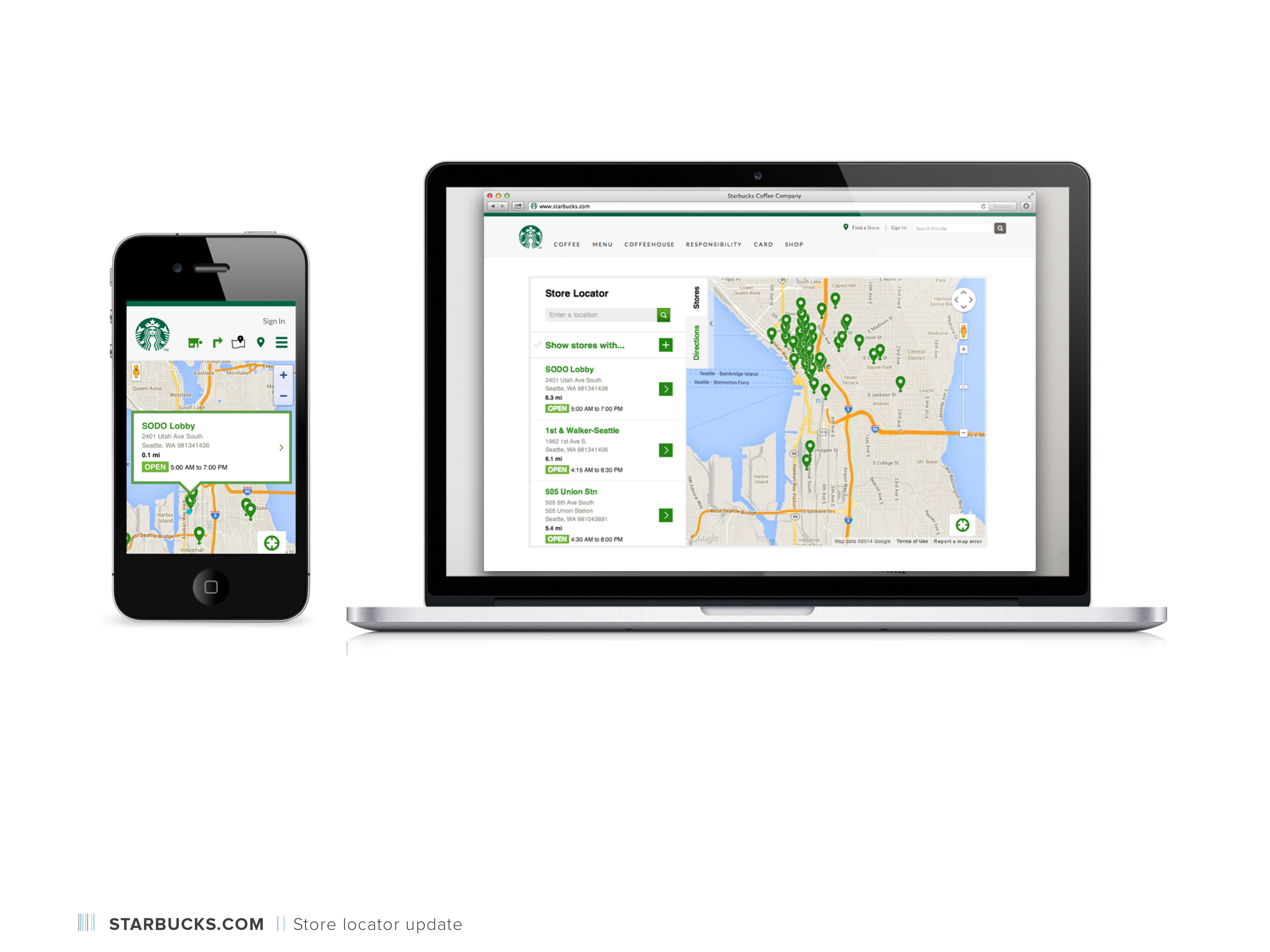
Starbucks store locator

Store locator

Starbucks eGift

eGift redesign

What made this work interesting

Working in-house with such a large, global brand means every decision has to hold up at scale – across languages, devices, campaigns, and customer expectations built over decades. There's no hiding behind a small audience. At the same time, the Starbucks brand has such a strong foundation that the design work is partly about stewardship: staying true to what makes the brand feel like itself while finding room to modernize and improve.

It also sharpened my instincts around consumer-facing UX specifically – the difference between designing for a technical user who will invest time in learning an interface, and designing for a customer who is making a quick, often mobile decision and needs things to be immediately obvious.

Starbucks

An illustrative sketch of a flower

Starbucks

In-house contract designer on a global site redesign – consumer experience at one of the world's most recognized brands

Overview

Starbucks.com is used by customers around the world, in a variety of languages. As a contract designer embedded in the Starbucks digital team, I was brought in to help design a global update to the site – starting with the homepage. The goal was a more modern design and a flexible system that could offer a rich, informative experience for customers. I worked with the internal project team, including a UX researcher, engineers, and multiple stakeholders – as well as outside vendors. My role covered visual design and collaboration on the new CMS, ensuring on-brand execution of the redesign across a growing digital footprint.

My role

Contract visual designer, in-house. Worked closely with colleagues on the Global Web Team to design appealing and intuitive interfaces – for desktop, tablet, and mobile devices – in order to help our customers easily and effectively engage with Starbucks.com.

The work

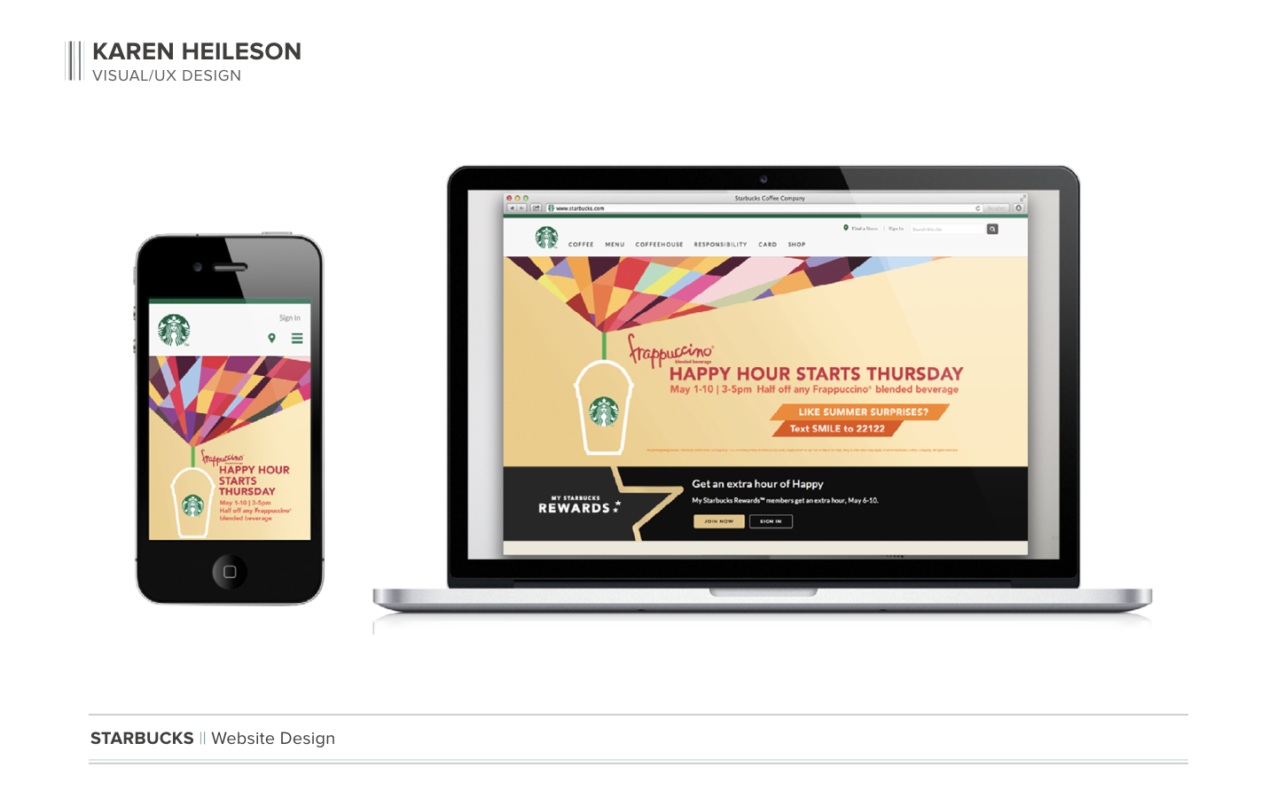
HomepageThe homepage was the starting point for the redesign – the foundation everything else would build from. We wanted something that felt modern and flexible, able to surface seasonal campaigns and evergreen content without feeling rigid. It needed to be responsive, and to display Starbucks Rewards stats to customers with various amounts of information that needed to be easily scannable – in multiple languages.

Starbucks homepage + rewards dashboard

Starbucks homepage + rewards dashboard

Starbucks.com/coffeeAfter launching the new homepage and global nav, we took on the coffee section – a set of rich, immersive pages designed to help customers easily and intuitively find their perfect coffee, learn how to brew, and shop for beans. The challenge was balancing depth of content with clarity of navigation, and making the experience feel as inviting as the product itself.

Starbucks coffee

/coffee

Store LocatorThe Store Locator is one of the most-used features on Starbucks.com and my first project as a contractor. Working with the Global Web Team, I worked up wireframes to create a clean, attractive, and intuitive interface – one that had to work equally well on desktop and mobile, for a customer who just wants to find the nearest store fast.

Starbucks store locator

Store locator

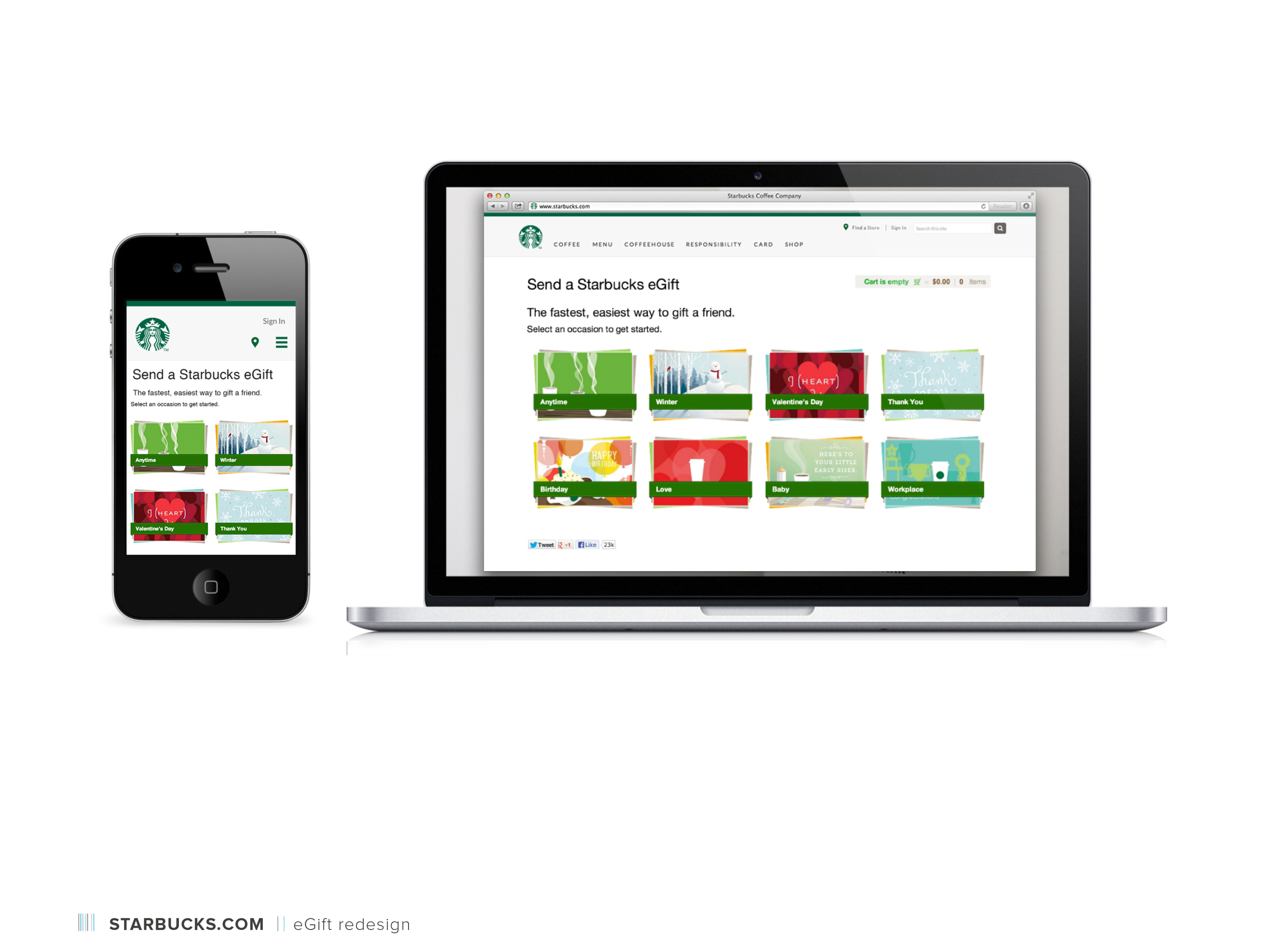
Starbucks eGiftI was part of the team tasked with improving the eGift experience. The redesign improved the selection and purchase process for the customer, and allowed the card team to offer more choices from its library of eGift cards. It's a good example of a small surface area with meaningful business and customer impact – making gifting feel easy and delightful is harder than it looks.

Starbucks eGift

eGift redesign

What made this work interesting

Working in-house with such a large, global brand means every decision has to hold up at scale – across languages, devices, campaigns, and customer expectations built over decades. There's no hiding behind a small audience. At the same time, the Starbucks brand has such a strong foundation that the design work is partly about stewardship: staying true to what makes the brand feel like itself while finding room to modernize and improve.

It also sharpened my instincts around consumer-facing UX specifically – the difference between designing for a technical user who will invest time in learning an interface, and designing for a customer who is making a quick, often mobile decision and needs things to be immediately obvious.

Starbucks

An illustrative sketch of a flower

Starbucks

In-house contract designer on a global site redesign – consumer experience at one of the world's most recognized brands

Overview

Starbucks.com is used by customers around the world, in a variety of languages. As a contract designer embedded in the Starbucks digital team, I was brought in to help design a global update to the site – starting with the homepage. The goal was a more modern design and a flexible system that could offer a rich, informative experience for customers. I worked with the internal project team, including a UX researcher, engineers, and multiple stakeholders – as well as outside vendors. My role covered visual design and collaboration on the new CMS, ensuring on-brand execution of the redesign across a growing digital footprint.

My role

Contract visual designer, in-house. Worked closely with colleagues on the Global Web Team to design appealing and intuitive interfaces – for desktop, tablet, and mobile devices – in order to help our customers easily and effectively engage with Starbucks.com.

The work

HomepageThe homepage was the starting point for the redesign – the foundation everything else would build from. We wanted something that felt modern and flexible, able to surface seasonal campaigns and evergreen content without feeling rigid. It needed to be responsive, and to display Starbucks Rewards stats to customers with various amounts of information that needed to be easily scannable – in multiple languages.

Starbucks homepage + rewards dashboard

Starbucks homepage + rewards dashboard

Starbucks.com/coffeeAfter launching the new homepage and global nav, we took on the coffee section – a set of rich, immersive pages designed to help customers easily and intuitively find their perfect coffee, learn how to brew, and shop for beans. The challenge was balancing depth of content with clarity of navigation, and making the experience feel as inviting as the product itself.

Starbucks coffee

/coffee

Store LocatorThe Store Locator is one of the most-used features on Starbucks.com and my first project as a contractor. Working with the Global Web Team, I worked up wireframes to create a clean, attractive, and intuitive interface – one that had to work equally well on desktop and mobile, for a customer who just wants to find the nearest store fast.

Starbucks store locator

Store locator

Starbucks eGiftI was part of the team tasked with improving the eGift experience. The redesign improved the selection and purchase process for the customer, and allowed the card team to offer more choices from its library of eGift cards. It's a good example of a small surface area with meaningful business and customer impact – making gifting feel easy and delightful is harder than it looks.

Starbucks eGift

eGift redesign

What made this work interesting

Working in-house with such a large, global brand means every decision has to hold up at scale – across languages, devices, campaigns, and customer expectations built over decades. There's no hiding behind a small audience. At the same time, the Starbucks brand has such a strong foundation that the design work is partly about stewardship: staying true to what makes the brand feel like itself while finding room to modernize and improve.

It also sharpened my instincts around consumer-facing UX specifically – the difference between designing for a technical user who will invest time in learning an interface, and designing for a customer who is making a quick, often mobile decision and needs things to be immediately obvious.